We’ve all seen it—an ad that looks like it was created by an amateur. Chances are, it was! Years ago, ad and content creation was strictly the domain of professionals; people who attended a university or a technical school to learn how to design for mass communication and maximum effect.
The difference between professional design and something that looks 'good enough' is science. Researchers throughout the years have studied how the human eye and brain perceive information. “Professional” design takes into account that knowledge, and produces a composition that first captures the eye, drawing the viewer's attention, and guides it through the path of information. Graphics and text are laid out to capture attention and lead the viewer to the desired information, which helps lead to the desired outcome.
Amateur design rarely achieves that type of engagement from the viewer. Poor design can confuse the viewer and push them away from your content, and onto something more understandable or visually pleasing. Possibly the worst outcome is the impression it makes on the viewer. They can and will associate the quality of your advertising with the quality of your product. If an "amateur" ad is the first impression someone gets about a company, it could lead them to doubt the credibility of the advertiser.
Your advertising and marketing is certainly part of what forms a prospective ticket-buyer's desire to attend a performance or event. While on stage or in a performance, your organization demonstrates the highest professionalism. So when it comes to creating content and ads, do the same.
The Importance of Images
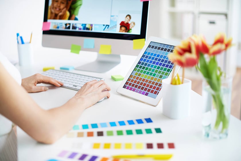
More than half of people identify as visual learners, meaning they take in information best through sight, reading, or seeing pictures. And in fact, everyone perceives images before text. So images are a critical part of telling the story of your event. Have you heard the old saying a picture is worth a thousand words? That only works if your images are appropriate. Images have the power to evoke feelings and can either engage a viewer or tell them it's not worth their time.
The most common problems with images are sharpness and distortion. Fuzziness or stretched objects should be automatic disqualifiers. And whenever images are uploaded, there are size guidelines that need to be followed. A great image will not work if it's not the correct size.
Do a Photo Shoot
Every organization should consider having professional photos taken to support their marketing efforts. It costs up front but you can get years worth of images from one session. Or maybe you've taken advantage of today's phone photo tech to become a decent photographer yourself. Professional photo equipment is everywhere now—but you need a good operator behind the camera! An investment in a professional to shoot and adjust your images can pay off many times over when quality marketing is attracting new audiences and boosting your revenues.
Make Sure You Have The Right Sizes and Shapes
You may have images that are beautiful but cannot be used because of their size or shape. A good guideline is to make sure you have a square, and both vertical and horizontal rectangles at 300ppi with good margins around the main image. They can then be cropped and resized to accommodate a variety of uses.
Copyrighted Images
It's easy to get beautiful, professional stock photography that can serve many purposes in your marketing. Easy, but not free. Most images that are great and available for use are copyright protected (owned) by the photographer and/or agency, and advertisers must pay for use, and agree to only specific uses spelled out in contracts. Using images without regard for ownership can result in a lawsuit and more bad consequences for your marketing plans. Here's an easy way to remember it: a copyrighted image is one you don't have the right to copy. Don't do it!
At CultureOwl, your marketing story begins with our events calendar. Create your upload with a stunning, beautiful image that will jump out of the calendar page. Now, beauty means different things to different people but remember that some things are proven attention-getters! Strive for an eye-catching image that also tells viewers something about your event.
Calendar Do's & Don'ts
Do |
Don't |
|
|
 |
|
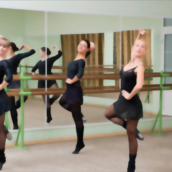
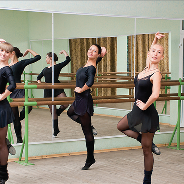
Do use sharp photos. |
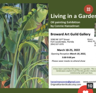
Don't use blurry photos. |
Do |
Don't |
 |
 |
|
Do focus on the beautiful image and let people click thru to additional info. |
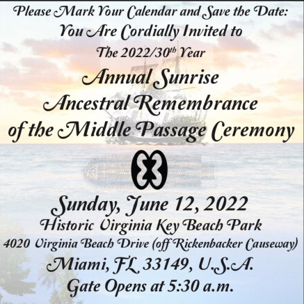
Don't put the details with the image. |
Do |
Don't |
 |
 |
|
Do use just the image. |
Don’t cover a nice image with the same details that can be found once they click. |
Do |
Don't |
 |
 |
|
Do use text as typography or integrated into the design. |
Don’t cover a nice image with the same details that can be found once they click. |
Many event calendars are designed to post flyers; not CultureOwl. Our followers really enjoy interfacing with the CultureOwl calendar because it's presented in an attractive, engaging, and credible way. Beautiful images capture attention, then additional information is found in the title below the image. When that sparks interest, one click brings your event prospect to your event page which features all the details, including relevant links.
We feature events on the main page of the site based on the quality of the image. If an event has a beautiful image, it is likely to be featured. One more important note about images without text—they are necessary for our social media posts. Due to social media site rules, we cannot use text-heavy photos to create paid social media boosts. The images must look like a photo, not an ad. So please keep this in mind!
Best Banner Ad Practices
Long gone are the days of having to cram all your information onto one crowded ad! That is the goal of digital advertising—to keep people engaged (clicking) all the way to the "Buy Tickets" page.
On the CultureOwl platform, every ad is a link to the URL of your choice. The main purpose of a banner ad is to grab attention—they only appear for a few seconds then they're gone. But the interested will click on! They are similar to a billboard that you pass on the highway, except that in digital ads, once your attention is captured, you can find out more instantly. Readability is usually an issue with a banner ad—too much type is often unreadable.
Conclusion
The CultureOwl team consists of marketing professionals who want to help you succeed. We offer advice about the best practices for marketing in general, and about what we know to be the best, most effective practices for advertising and posting on the CultureOwl platform. Let us help you look good!